
Art+Tech Summit
Brand identity for Christie’s Art+Tech Summit, encompassing various touch points across digital, print, motion, and merch.
Visual Language development
Starting from existing illustrations and a preliminary logo, I worked to distill the intricate illustrations into a functional graphic language that was usable in text-heavy scenarios.
Ultimately, I developed a cohesive set of backdrops and original components that retained the essence of the illustrations, while greatly enhancing their functionality.

Key palettes + color relationship

Graphic language components

Combined in use, with text on lanyards and signage


Process – the lanyards served as a testing ground for iteration
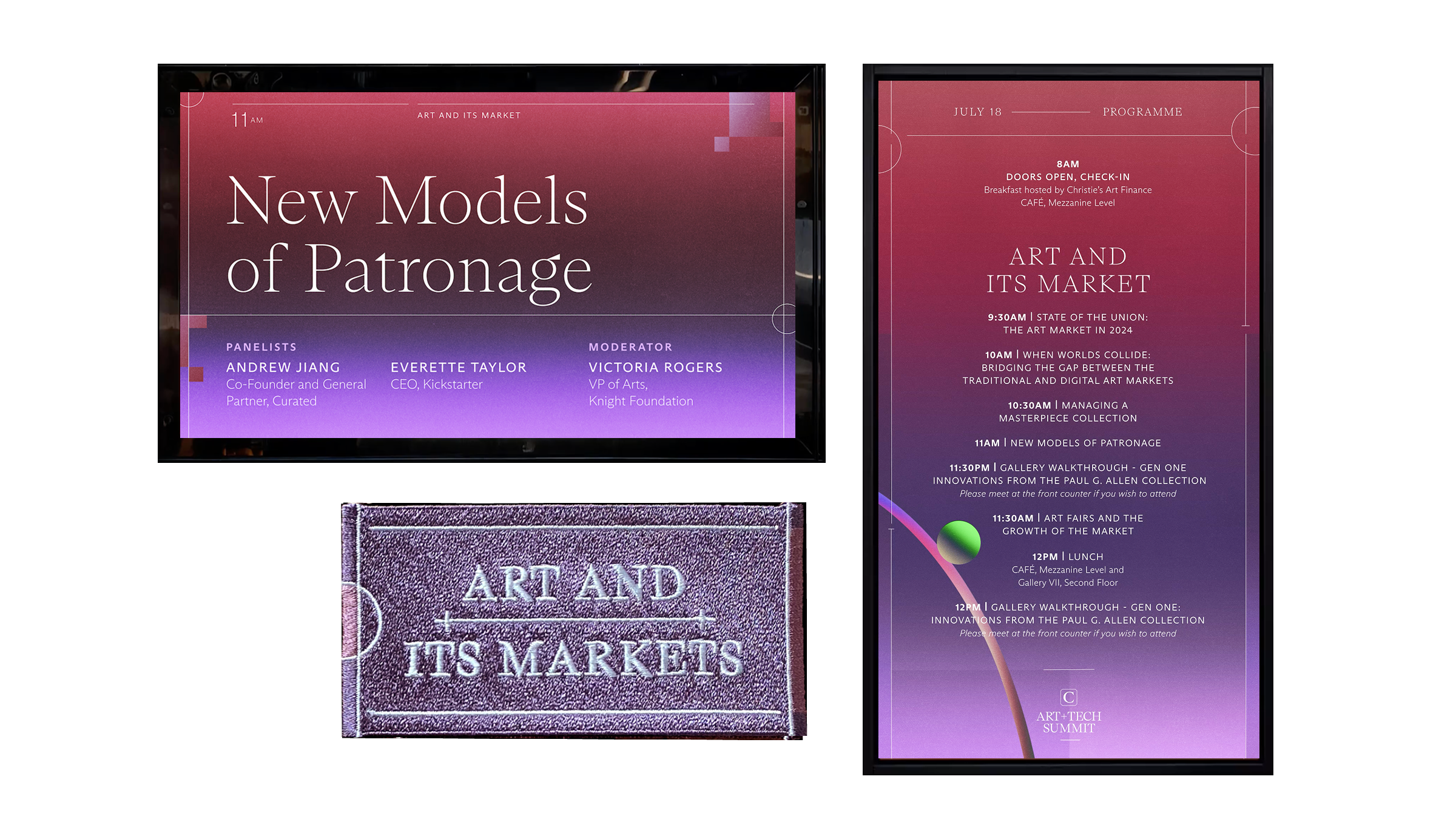
Textiles and Patches
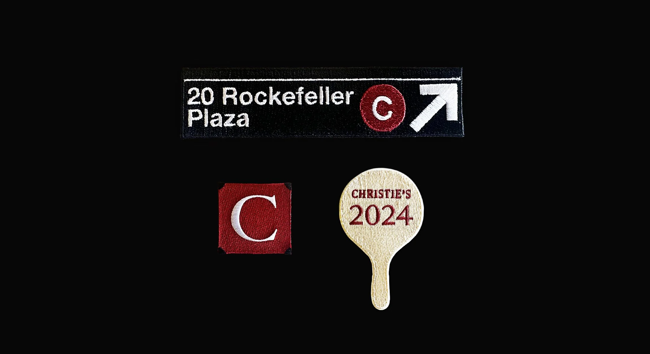


Along with Christie’s-branded patches, I designed patches reflecting the four thematic pillars of the event.
These color schemes were derived from the panel screens design and daily program video loops, creating thoughtful cohesion throughout the event at various touch points.
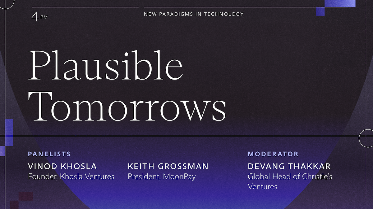
Program panel screens
The color schemes for the summit pillars begin with light and warm tones in the mornings, and transition to cool and dark in the second half of the day.


Motion
Looping daily program animation, designed corresponding to the four pillars of the conference.
Four pillars colorways on various applications


Foyer wall vinyl design spotlighting the conference pillars


MoMA event Screens
I designed custom screens for a conference reception at the MoMA, re-setting the type to fit within the panel screens without truncation.
